If you are in the photography industry for any length of time, sooner-or-later, the subject of calibration will come up. And more-often-than-not, it comes up in the context of being something that is essential for both photographs and editors. But is it?
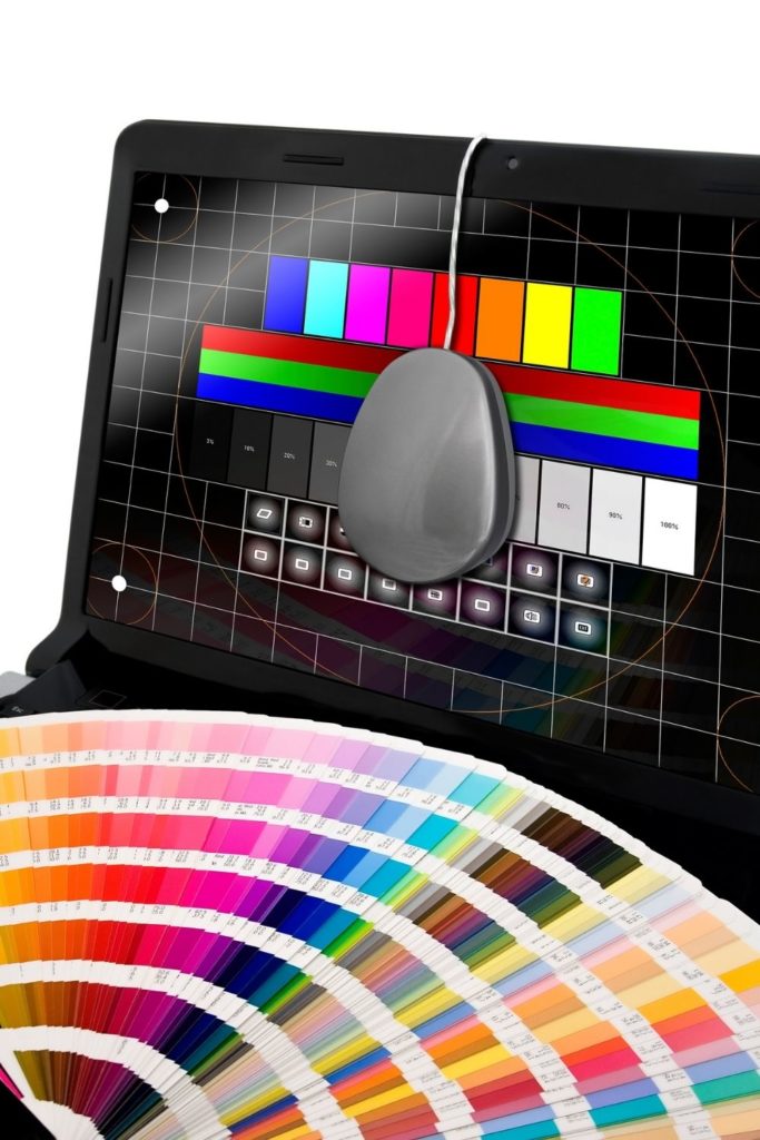
WHAT IS COLOR CALIBRATION
Not all screens and/or monitors display colors the same. Some are warmer (yellowish tones) or cooler (blueish tones). And if everything on the screen is tinged in either of these colors, your eyes will interpret white, as white, even if it is not a true white. Our eyes play tricks on us.
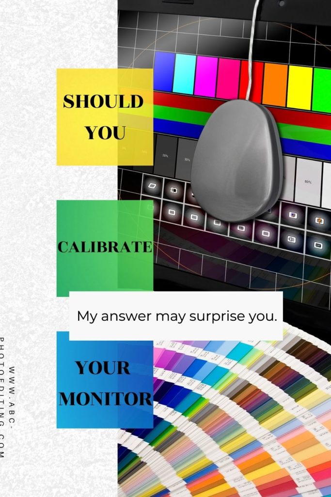
So a warm or cool monitor, changes how our eyes see the colors in an image. This is where color calibration comes in. By calibrating the white values of your display, and other things like brightness and saturation you will see your images correctly. Or will you?
SO DOES CALIBRATION WORK
In my experience working as an editor for almost 6 years, monitor calibration really doesn’t make much of a difference. And here are a couple of reasons why.
- Everyone in the world has a different monitor, so no amount of calibration will make your photos better or look the same on every screen. And there is never a guarantee that what I see on my screen is what my neighbor will see on his. For example, a photo could look perfect on my monitor, and look like a muddy, lifeless image on my neighbor’s computer. Calibration won’t fix that.
- Even if your monitor is calibrated, your mages will look different at different times of the day, even on the same screen. They will also look different in different locations. Where we edit, what time we edit, and what color casts may be around us will all have an effect on how the image looks on our screen.
For example, if I edit a photo at night in my office. And then look at it again, in the morning at the kitchen table, it will look very different. I may even think it needs to be re-edited.
So because every screen is different, that means that everyone looking at your images is going to see it slightly differently than you do. And again, no amount of calibrating can change that fact.
WHAT I DO INSTEAD
So because I know the way my eye sees an image, changes depending on the above factors, I do not rely on my screen to determine proper color. I use a Reference Collage. I got this idea from Amy Grover. Her and her husband are the creators of Noble Presets.
The idea is this. You create a perfect collage of images; perfect white balance, perfect contrast, perfect color, etc. And then you use that as your reference point while editing. You edit in Reference Mode (I show you how here) using your collage. If the image you are editing, matches the reference image, then you KNOW the photo you are editing is perfect, regardless of how it might look on the screen.
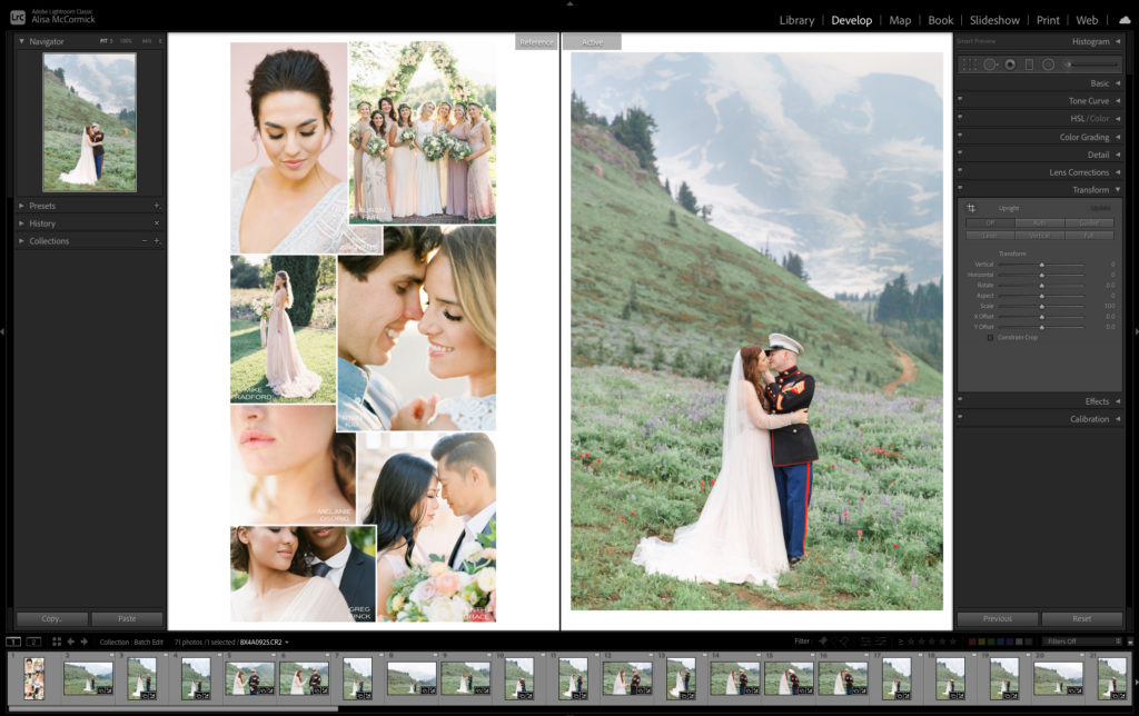
For example, if you are sitting on a blue coach, which is causing a color cast on your screen, the whites in your image may have a blueish look to them. But if the whites in your reference collage match the whites in the image you are editing, you know the edited image has proper white balance.
That frees you, as the editor!!! Regardless where you are editing, or what time of day you are editing, your images will look beautiful, consistent, and cohesive from gallery to gallery, because you are using a reference image instead of relying on an unpredictable screen.
In the IGTV below, I talk about it in a little more depth. Watching it will probably bring even more clarification.
If you found this helpful, I have many tutorials on my You Tube Channel where you will find weekly Lightroom editing tips and shortcuts. Be sure and SUBSCRIBE so you’ll never miss them. And please share this with a friend who also loves to edit!
If you have editing questions, never hesitate to reach out. I am always here to help. DM me on Instagram @alisamccormick and let’s chat! I am an open book and love to help others grow on their editing journeys.
Until next time, Happy Editing!

leave a comment